Satyajit Ray – a man who had the deepest impact on me when it comes to cinema, a man who taught me to understand cinema as a form of art and fall in love with this medium.
Amidst these gloomy days that we are in right now, could there be any other auspicious day for me to start writing again than the birthday of the master himself?
The world knows that Satyajit Ray played a varied number of roles in the world of filmmaking.
He was a filmmaker and screenwriter who is hailed as one of the world’s best, whose unique as well as universal style of storytelling inspires all young filmmakers across the globe to this very day.
He was a music composer and lyricist who believed that music was intrinsic to the sensibility of a film. His music was called “haunting and soul stirring at the same time” by composer Maurice Jarre. His love for classical music – both Indian and Western – was evident in every score he composed. It was his music that made the flow of the narrative simpler for us. The emotions of his characters found better expression through his musical notes.
He was an author who wrote innumerable novels and short stories for children, his greatest literary gift to us being Feluda, which is immortalised through the evolution of a character to a cult icon to an emotion (well, Feluda is definitely a topic for another discussion). He also penned a collection of non-fiction essays on his experience of shooting and on his childhood. Ray’s anthology of film criticism, “Our Films, Their Films” is an absolute treat for cinephiles. His books have also been translated in English, German, Polish, French, Spanish, Italian and other Indian languages.
The director is the only person who knows what the film is about.
It was because of this man that I learned about the word “auteur” and he defines it to perfection. He had mastered almost all the aspects of filmmaking.
But there is one more side of him that is comparatively unknown. He was also a brilliant graphic designer. Long before his emergence as a film icon, long before looking through the lens for the first shot of Pather Panchali, he started his career as a graphic illustrator. He designed book covers, film posters and illustrated children’s books among other and even created two award winning Bangla fonts. What is profound in his work is the sophisticated experimentation with various artistic styles and traditions, both local and foreign, without compromising authenticity. Let’s celebrate the start the centenary of Ray, by looking at this hidden gem in his creative crown which was often webbed strongly into his oeuvre.
Among all the factors that defined his artistic style, Ray considered his days in Shantiniketan as the period in his life that had the most significant impact on his art. He enrolled himself as a student of Fine Arts in Shantiniketan in 1940. Shantiniketan’s Kala Bhavan was known for its emphasis on Indian traditions, originality and creativity. Artists at Kala Bhavan were well aware of the prevalent mediocrity of mainstream art and rejected commercial styles and themes on principle. Instead they chose to depict cultural authenticity and social criticism.
“The hostel verandah was usually our drawing room. We would gather and talk endlessly about the current world scene of art […]. The discussions were rambling and endless; names like Paul Klee, Brancusi, Kandinsky, Juan Miró, Picasso, Salvador Dalí and Cézanne were used as sterling currency. The Indian artists whose names graced the list were but few. Binodebehari, Nandalal, Ramkinkar, Rabindranath, Abanindranath and for a change, Jamini Roy. No artist from Bombay could find favoring this elite list. They were just crass imitationists who painted to please customers instead of themselves.”
This excerpt from “Satyajit Ray- An Intimate Master: Those Kala Bhavan Days” by Dinkar Kowshik is a statement of their ideological commitment
Ray’s teachers Nandlal Bose and Binodebehari Mukherjee in Shantiniketan were extremely talented artists with a pan-Indian approach towards art. Studying classical and folk art under them helped Ray to understand and appreciate the values that made Indian art exceptional.
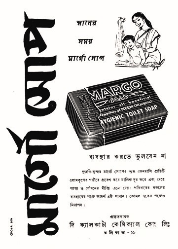
However, in 1943, he dropped his fine-art degree midway to start his career as a junior visualizer at the British advertising agency DJ Keymer- and later went on to work with Signet Press and become one of India’s leading book designers. There he was asked to illustrate commercial products that gained him well deserved fame. Ray’s advertisement often presented a single image of the product reproduced on a larger scale. The enlarged and half-opened soap in Margo Soap and the pack of cigarettes with one stick sticking out in Tenor Always both employ this technique; it not only provides the audience with an interior glimpse of the product but also familiarises the product with the audience’s memory due its highlighted isolation.

He also designed magazine covers and using his training in calligraphy to create typefaces for Bangla and English, including Ray Roman, Ray Bizarre, Daphnis and Holiday Script. Two books – “Looking Beyond: Graphics of Satyajit Ray” by Jayanti Sen and “Satyajit Ray: A Vision of Cinema” by Andrew Robinson – cover his groundbreaking graphic design work in great detail.

In 1961, Satyajit Ray relaunched the children’s magazine Sandesh that was originally found by his grandfather. In his illustrations for Sandesh, Ray’s use of folk motifs comes up more significantly. The cover designs incorporate colourful geometric and floral patterns native to alpana art done by Ray himself. They appear in saturated primary colours and have a texture similar to wood block printing. The foregrounded figures are painted in folk motifs similar to the woman in Tea with Music but with added energy.

Satyajit Ray revolutionised book jacket designs in Bengali literary traditions with his incorporation of styles beyond the depiction of book content. The designs are a progression of different artistic styles that Ray has mastered overtime. These graphic techniques later transferred over to his poster designs as well.
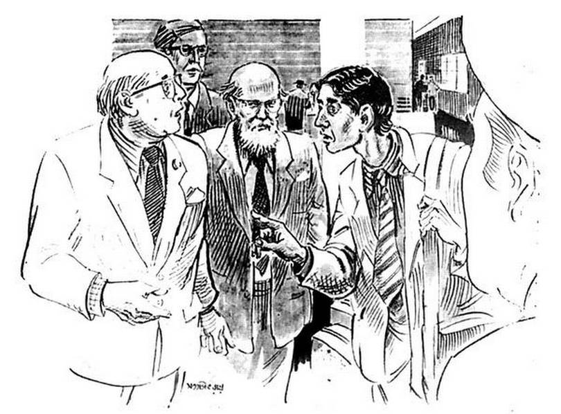
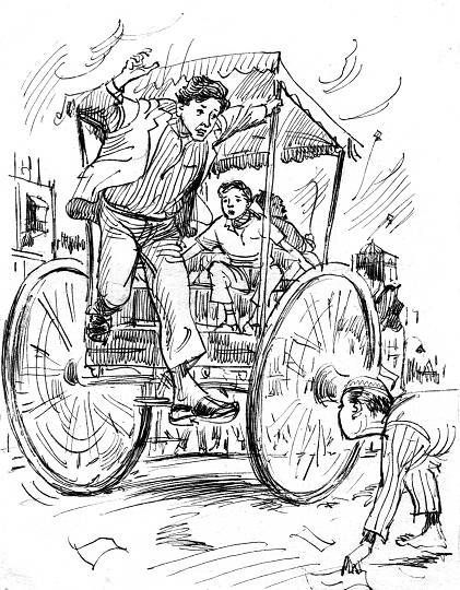
Ray’s etchings of scenes from the Feluda and Shonku collections tread away from such creative conceptions and retort to traditional illustrative styles. He deploys a style of narrative realism where the characters are outlined poignantly with little background noise and adhere close to actual proportions and scale. The traditionalism is apparent in the sketchy nature of the drawings that were prevalent in older woodcut etchings used in publishing. The scenes are grounded and convey a pictorial reading of Ray’s fictions.
His expertise as a narrative illustrator influenced his filmmaking methods heavily. In fact, Ray came up with the idea of his first film Pather Panchali when he was illustrating Bibhutibhushan Bandyopadhyay’s children book of the same name for an abridged version entitled Aam Antir Bhepu. Ray is known predominantly as an image-driven storyteller due to his phenomenal scene compositions. He owes much of this grace to his storyboard creation phase. Ray spent a monumental amount of time painting his scenes which materialised in every frame as a composition of the greatest merit.
“He did some sketches in a drawing book after he had come back from London in 1950 and illustrated a succession of pictures (in pen, brush and ink) for the sequences of frames as they would come up in the film.”
Sandip Ray writes in the preface to Pather Panchali Sketchbook, which was edited by Sandip Ray and published by Harper Collins in 2016. It contained images from the storyboard of the film giving us an insight into Ray’s creative process.
Composing the perfect frame also consisted of imagining the separate components constituting that frame including character looks and costume design. Ray’s now famous kherorkhata (Red Notebook) contained numerous drafts of costume designs and character outlooks.

The decorative appearance of the ghosts from Goopy Gyne Baagha Byne and the costume designs from Hirok Rajar Deshe were both sketched initially in Ray’s kherorkhata. This sketching process lends itself to the ornate composition of Ray’s frames.

Lastly, it goes without saying that Ray’s poster designs for his films depict an exceptional brilliance of the graphic arts. He experimented with photomontage well before it took off in the mainstream Hindi-language film posters in India. I have listed below some of his most iconic and my favourite poster designs.
Pather Panchali:

The poster for Pather Panchali gives us a window into the life of young Apu, along with his mother and sister Durga – the two most influential figures in his life. A lovely portrait of a family oozing with warmth and affection, the image is set inside a circle that resembling traditional alpana art. The folk-art inspired motifs of footprints, fish and the sun give it a rural simplicity and charm.
Devi:

The poster for Devi is probably one of Ray’s most recognizable and iconic designs. Ray presents the extreme side of faith here. The face of the protagonist Dayamoyee, is divided in two shades, light and dark suggesting the benign and malignant sides of the devi (goddess). The title typography is made to resemble a temple, a shrine for the goddess.
Charulata:

A masterclass in minimalism, the poster for Charulata features a portrait of the protagonist created simply with a calligraphic brushstroke. It shows the deep humanity of the protagonist by bringing out Charulata’s longing and sadness in such a seemingly effortless manner. It also establishes her gaze and point of view, which dominates the film.
Ghare Baire:

The chiaroscuro inspired poster for Ghare Baire powerfully uses the play of light and shadow to create depth and contrast, depicting a woman standing at the threshold of the outside world, while the dark interiors of the house symbolize tradition and old social mores. It presents the clash between the old and new ways of thinking. And this is actually the last shot of the film, and my most favourite moment in the entire film
Ray’s poster art did not simply advertise the film; they served as an extension of his artistic vision of the film and communicated the essence of the film to his viewers. Throughout his prolific oeuvre he established that commercial art could serve a functional purpose without sacrificing artistic expression, which is so much evident from his art of graphic design as well.


Wonderful! Satyajit Ray is truly one of my favourite fimmakers and perhaps the best India has ever produced. His many talents are beautifully expressed in your post!
LikeLiked by 1 person